If a picture is worth a thousand words, then a graphic is worth 10,000 — but only if it’s accurate, clear, and understandable. This field guide has 20 points to keep in mind as you edit graphics.
1. Margins
Does the graphic fit within the margins of the page? Check any type, artwork, or borders around the edges. Is anything cut off?
2. Legibility
Are colors, general design, and typefaces consistent within each graphic and among all graphics? Is all content legible? Check for blurry screenshots, poorly cropped photos, or type that’s too small. Check that spacing around graphics, legends, and captions is consistent.
3. Numbering
If you’re editing a document with more than one graphic, are the graphics numbered sequentially? If the numbering convention calls for starting over in each section, make sure this is done.
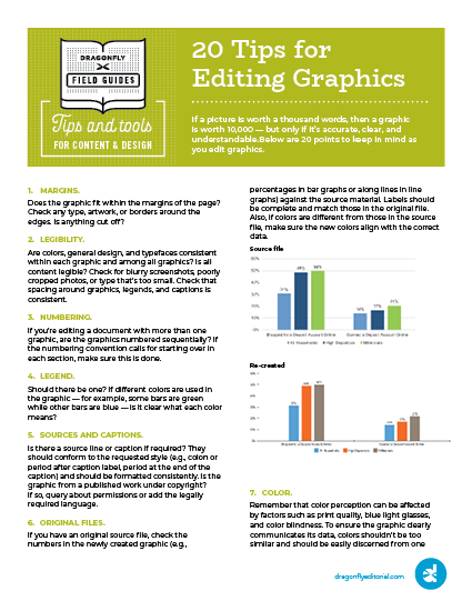
4. Legend
Should there be one? If different colors are used in the graphic — for example, some bars are green while other bars are blue — is it clear what each color means?
Read the rest of the tips by downloading the PDF below.