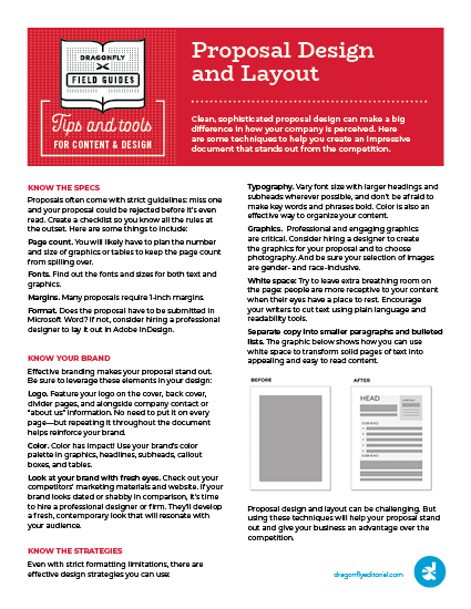
Good proposal design differentiates your business capabilities over your competitor’s. There are several steps you can take to make the process go more smoothly and to help you create an impressive document that makes your company stand out.
KNOW THE SPECS
Proposals often come with strict formatting guidelines: miss one and your proposal could be rejected before it’s even read. Create a checklist so you know all the rules at the outset. Here are some things to include:
Page count. Be mindful of page limits: you will likely have to plan the number and size of graphics or tables accordingly to keep the page count from spilling over.
Fonts. Find out the fonts and sizes for text and graphics.
Margins. Some proposals require 1-inch margins.
Format. Does the proposal have to be submitted in Microsoft Word? If not, consider hiring a professional designer to lay it out in Adobe InDesign and submit it as a pdf instead.
KNOW YOUR BRAND
Effective branding makes your proposal stand out. Be sure to leverage these graphic elements in your design:
Logo. Feature your logo on the cover, back cover, divider pages, and alongside company contact or “about us” information. Don’t plaster your logo on every page—but repeating it throughout the document visually reinforces your company brand.
Color and Fonts. The impact of color can’t be overstated. Use your company’s color palette throughout the proposal, in graphics, headlines, subheads, callout boxes, and tables. Use your brand fonts anywhere the proposal standards allow.
Look at your brand with fresh eyes. Check out your competitors’ marketing materials and website. If your brand looks dated or shabby in comparison, it’s time to hire a professional designer or firm. They’ll develop a fresh, contemporary set of graphic elements and a strong brand that will resonate with your audience.
KNOW THE STRATEGIES
Even with strict limitations on formatting, there are effective strategies you can use to improve your design.
Typography. Vary font size with larger headings and subheads wherever possible, and don’t be afraid to make key words and phrases bold. Color is also an effective way to organize your content.
Graphics. Professional and engaging graphics are critical. Consider hiring a designer to create the graphics for your proposal and to choose photography. And be sure your selection of images are gender- and race-inclusive.
White space: Try to leave extra breathing room on the page: people are more receptive to your content when their eyes have a place to rest. Encourage your writers to cut text using plain language and readability tools.
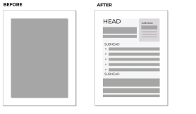
Separate copy into smaller paragraphs and bulleted lists. The graphic below shows how you can use white space to transform solid pages of text into appealing and easy to read content.
Proposal design and layout can be challenging. But using these techniques will help your proposal stand out and give your business an advantage over the competition.